A few visual and innovative treats we’ve come across this week at Flipside, through work and play.
1.Motion graphics: Method designs, Motion capture piece, dynamic, colourful, awesome!
ARVE Error: src mismatchprovider: youtube
url: https://www.youtube.com/watch?v=qBnpEW8Su3Y
src in org: https://www.youtube.com/embed/qBnpEW8Su3Y?wmode=transparent&rel=0&feature=oembed
src in mod: https://www.youtube.com/embed/qBnpEW8Su3Y?wmode=transparent&rel=0
src gen org: https://www.youtube.com/embed/qBnpEW8Su3Y
“Method Design wanted to create an entertaining piece of design that encapsulates the innovative and prolific nature of this industry. Our aim was to showcase the AICP sponsors as various dancing avatars which playfully reference the visual effects used throughout production. Motion capture, procedural animation and dynamic simulations combine to create a milieu of iconic pop dance moves that become an explosion of colorful fur, feathers, particles and more. ” SOURCE: METHOD DESIGN
#motiondesign #motiongraphics #motion
2.Surfing: The best man made wave ever?
Kelly Slater wave company has its own wave and it barrels! A realistic artificial wave allowing surfers to refine their skills without waiting for nature to provide swell. Check it out.
SOURCE: http://www.kswaveco.com
SOURCE: http://www.bloomberg.com/features/2016-kelly-slater-wave-pool/
#kellyslater #surfing
3.Apps: Kimoji, what?
Kim Kardashian has her own emoji’s, sounds rubbish and some of them are to be fair! But this one is really well-executed, animated and fun. Twerk it out! Ha Ha
SOURCE: KIM KARDASHIAN #kimkardashian #Kimoji #emoji #twerk
https://www.instagram.com/p/BGHhQmyuSx0/
4. Virtual reality. Mr Cardboard Custom google cardboard VR headsets
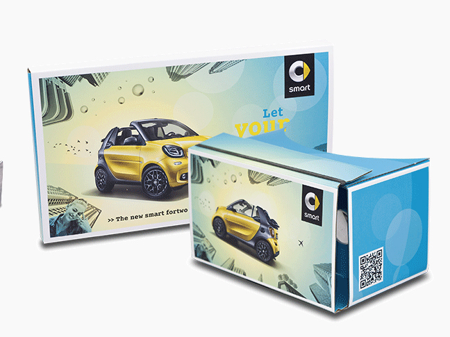
We did some research recently for a pitch and came across these guys that do custom cardboard headsets for marketing your own virtual reality apps. Brilliant for adding your own graphics and branding to the outside packaging for marketing at trade shows, exhibition or festival handout, you get the idea.
http://mrcardboard.eu/google-cardboard-work/
#virtualreality #google #googlecardboard #VR #festival #events #packaging
5. Branding: Ministry of Sound rebrand
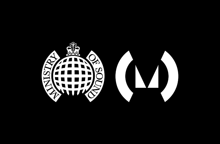
Spin has redesigned the Ministry of Sound logo, bold and more versatile. We grew up with the old logo, which sat well in the 90’s rebellious pastiche graphics of the time, we’ll miss the heritage and nostalgia, but can’t wait to see the new logo as part of the whole brand, bring on the new wave rave!
“The new logo incorporates the rounded “brackets” of the original logo but sheds the domed gate and crown, replacing them with a new triangular “M” mark. Spin has also removed the company’s name from the logo, in favour of a cleaner, more simplified icon.
Spin says it was inspired by the “spiky, irreverent qualities the club is famous for,” and wanted to respect the heritage of the brand, while opening up opportunities for the future development of the brand. It therefore decided to fuse elements of the previous logo with new ones, to honour the past while “simultaneously embracing the future.”
The original logo was designed by artist Chemical X, and was intended to be a twist on the House of Commons crest.
Spin have worked with Ministry of Sound on the identity concept, art direction, website consultation, printed material, motion graphics, signage, environmental graphics and stationery. The redesign coincides with the London night club and record label’s 25th birthday in 2016.”
SOURCE: ITSNICETHAT http://www.itsnicethat.com/news/spin-rebrands-ministry-of-sound-020616
#branding #logo #music #dancemusic